Scatter Plots 6R Name____________________ #____
A simple scatter plot will tell you more about the relationship between two interval-level variables than any other method of presenting or summarizing such data.
Rules for Scatter Plot
1. Use two interval-level variables.
2. Full define the variables with the axis titles.
3. The chart title should identify the two variables and the cases (e.g., cities
or states)
4. If there is an implied causal relationship between variables, place the
independent variable (the one that causes the other) on the X-axis and the
dependent variable (the one that may be caused by the other) on the Y-axis.
5. Scale the axes to maximize the use of the plot area for displaying the data
points.
6. It is a good idea to add data labels to indentify the cases.
|
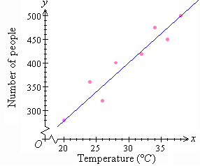
Note in this example how to use a broken line on an axis or both axes to maximize the space on the graph, to show the data clearly and to accomodate data that is a distance from 0. |
A line of best fit (or "trend" line)
is a straight line that best represents the data on a scatter plot. This line
may pass through some of the points, none of the points, or all of the points.
A Line of Best Fit is a line that describes the direction the points
are heading in.
Criteria:
-The Line of Best Fit must, more or less, follow the direction of the points.
- There should be roughly the same number of points on each side of the line.
Correlations: The word correlation in made of Co-
(meaning "together"), and Relation
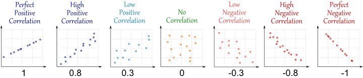
Positive Correlation: the x-coordinates and the y-coordinates both increase.
A Line of Best Fit will sit in this direction(/).
Negative Correlation: the x-coordinates and the y-coordinates both
decrease. A Line of Best Fit will sit in this direction(\).
No Correlation: there seems to be no pattern, and the points looked
scattered. There will be no Line of Best Fit.
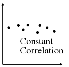
Constant Correlation: the x-coordinates increases and the y-coordinates
stay about the same. A Line of Best Fit will sit in this direction(-).
With good labeling of the variables and cases, common-sense scaling of the X and Y axes, there is not a lot that can go wrong with a scatter plot, although extreme outliers on one or more of the variables can obscure patterns in the data.